While driving back to Lorraine, my home region, I noticed that the said logo is now a vague alteration of the original coat of arms. This alteration make no sense and does not carry any value or meaning, unlike the original blazon. See for yourself:
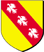 Original Coat of Arms (dated 1183)
 Current Logo (dated 1999)
I am not preaching the altar of traditionalism here: all I am saying is that the original coat of arms had a meaning, while the new one has not. The three birds on the red band was a reminder of the legend saying that Godefroy de Bouillon, the initiator of the first crusade who took Jerusalem in 1099, killed three birds with one arrow during the siege of the holy city.
The current logo is simply an aesthetic redesign of the original blazon: the red band has disappeared, the birds point to the top right corner and they look like arrow headed deltaplanes.
 Previous Logo (dated 1986)
In that sense, the previous logo was bearing more sense. Lorraine region is positioned on the hexagon that traditionally represents France. The colors represent the resources of the region (water, agriculture, steel industry...).
What is the lesson for us in the IT field? Let me propose the following: Let us not pursue novelty for the sake of itself but only if and when it brings new sense and value to our industry.